News
What makes a successful architectural visualisation?
For any Architect, successfully communicating to audiences what a project will look like when finished is a key challenge. On many of our projects, you’ll see stunning visualisations produced by our in-house graphics and visualisation manager Derek Jackson. Derek gives us an interesting insight into what he thinks makes a successful architectural visualisation, including a look at some of his favourites.
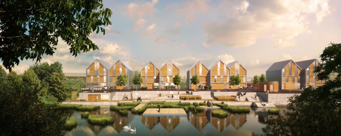
“The key thing is to tell the story behind the project – that’s what I try to do with every image from the beginning. We think about what we want the person viewing the image to see, what we want them to experience.
I have always found that the most successful visualisations of a building the ones that engage people in a way that helps them to relate to being in the space – rather than just a functional drawing of a façade, you can get a sense of what the space is like, what the quality of light is and what emotions you might feel when being there.
We use composition and lighting to direct the eye to the important aspects of the image. The viewer should naturally get drawn in to the image and focus on the elements important to our design. Colour palette is also crucial: a key early decision is what we want the sky in the image to look like and what time of day it is, because it sets the tone of the image and informs the lighting, and what you can see of the building. It also needs to work alongside the colours of the various building materials.
Explaining the form of the building is another key part of what the image must achieve, so making sure you can read the silhouette and depth of the building clearly is important. And ultimately, our buildings are designed for people, so where appropriate I will try to add a few people into the images, which can direct the eye to the key areas of focus, and also really bed the building into the setting, giving a sense of function and scale.
Here are a few of my favourite images from projects.
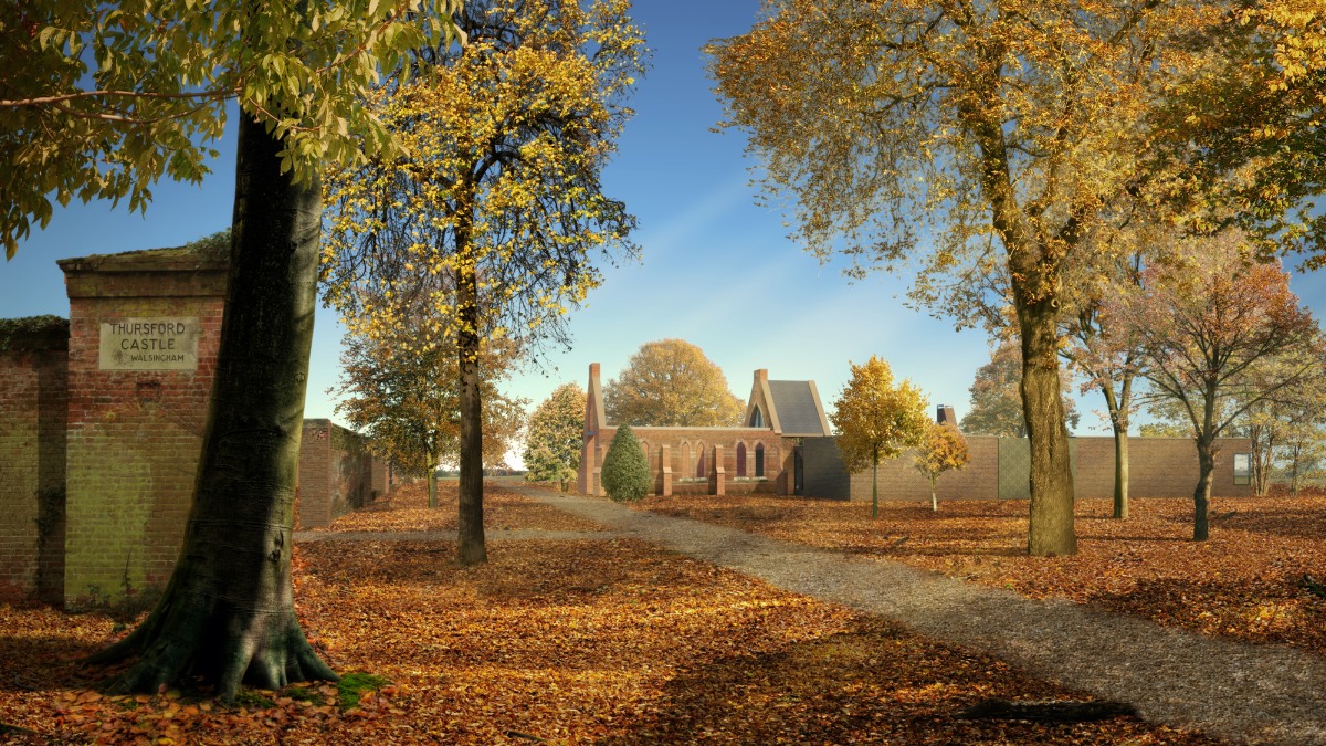
The setting of this residential design with a ruined chapel was already ‘romantic’, conjuring up ideas of mysterious forests and fairy tales. To continue the theme into the visual, I felt a warm autumn setting would help emphasise those story-like associations, and also allow a colour palette that complemented the building tones well.
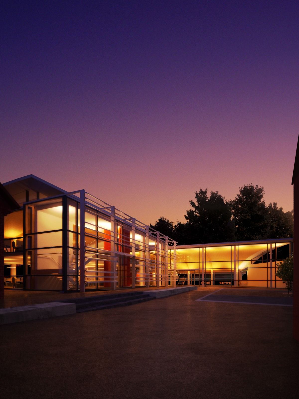
This visual for a workplace project in North Essex was one of the first dusk visuals I produced, so was a bit of an experiment and a steep learning curve! I wanted to play with sunset colours that worked alongside the timber cladding and fiery internal colour scheme. I was pleased that the image won an ‘Excellence’ award in the architecture section of Ballistic Publishing’s Expose 7 Digital Art Annual.
Norfolk Recycling Plant
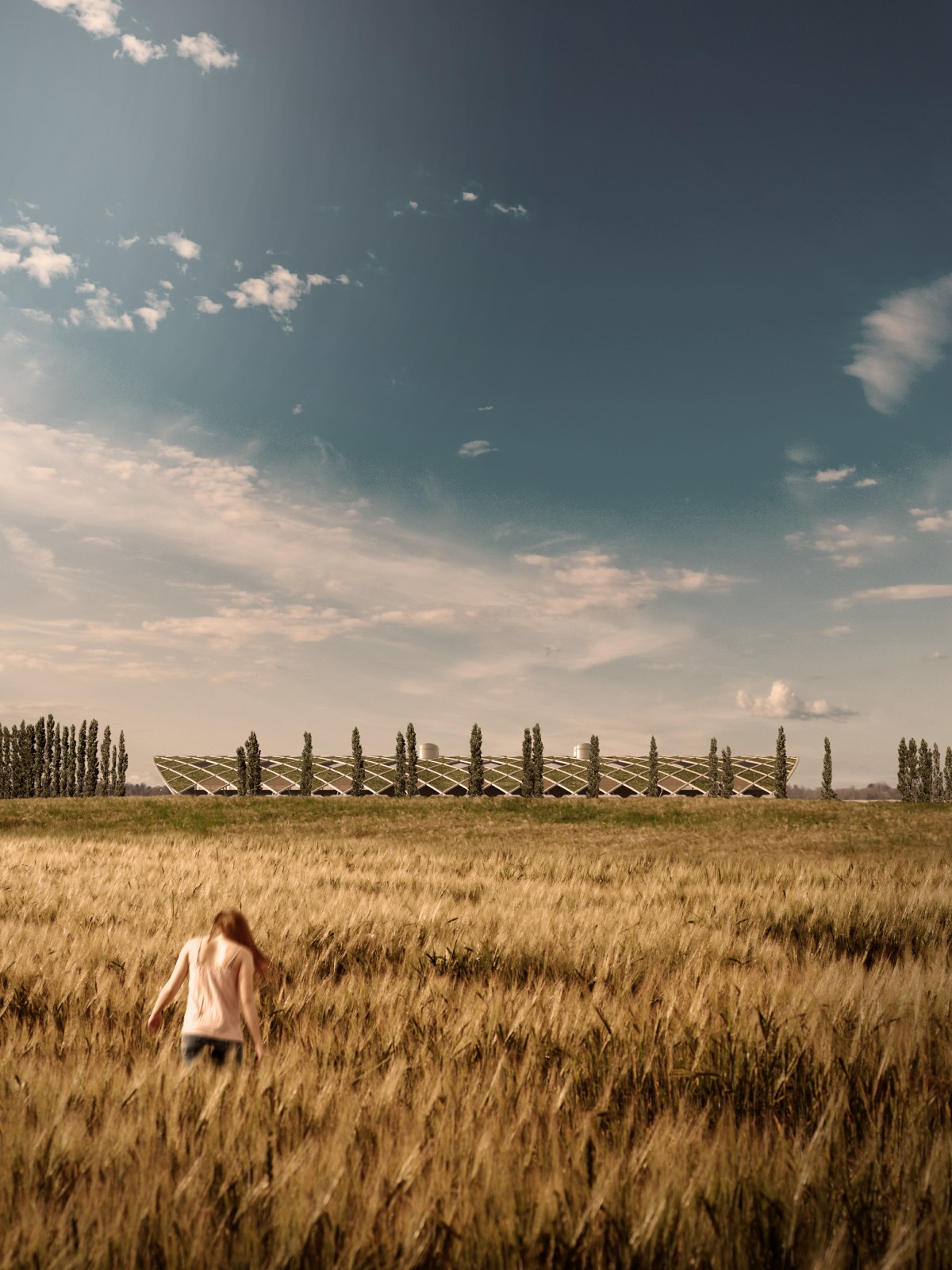
This image for a new recycling plant in Norfolk offered a lot of opportunities. Due to the strong green credentials of the building, I felt an image that maximised views of the natural environment would be key. To set the building in Norfolk (a relatively flat county!) I chose to emphasise the blue sky above the building giving a sense of wide open space, with the rule of thirds drawing the eye to the building in the distance.